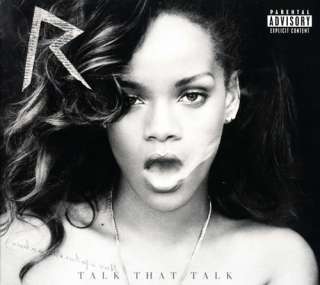
Thursday, 31 January 2013
Tuesday, 29 January 2013
Evaluation: Question 4
Audience Feedback
I interviewed around 5-6 people and asked them about their initial thoughts on the video, what they liked about the video and what they thought could have been changed or improved. The response I recieved from the audience were more or less all the same.
Each interviewee stated that they really enjoyed the editing of the video specifically the strobe lighting effect. They thought it flowed well, was edited well to the beat and really had the audience engaged as it built up to it's climax before each chorus. A very positive response, the audience understood what genre of music it was and who it was targeted at. They were able to relate to this type of genre because it is the type of music that is currently up and coming with higher demands from young people to see it more on our tv and computer screens. We recieved the same two criticisms of the video which was that our video needed to include more locations and that our artist should put more enthusiasm when performing. Over all the audience thought it was a very good video.
Taking on board with what the viewers thought, I couldn't agree more. Our video did lack in base tracks and we may have used about 3 or 4 but there wasn't a significant amount of difference. You couldn't tell them apart and majority of our video was filmed in the green screen. If I could change that I would definiately add 2 or 3 more locations, ones that were very significant, that stood out and that you could tell it was somewhere else. In terms of performance I personally thought I performed well taking into account that I don't really like being infront of the camera but rather behind it. However, my group couldn't make the risk of trying to find an artist within college or outside of college becuase they probably wouldn't be as comitted as us as it isn't their work. Over all I'm very happy with the response and video.
Monday, 28 January 2013
Saturday, 26 January 2013
Evaluation: Question 1
In what ways does your media product use, develop or challenge forms and conventions of real media products?
In many ways my media products follow the conventions of real media products but also challenge and evolve them to fit into today's perception of the ultimate media products. Products which look attractive and pull in possible customers, relate to the genre of the music and artist image and allow for fans to interact with the artist.
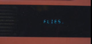
According to Andrew Goodwin, music videos don't follow the traditional narrative styles of novels and films for example. This is because pop videos are built around songs and often songs do not pose traditional narrative structures. So in place, there are 3 different types of relation between songs and their videos. The first is called illustration, this is when the video tells the story of the lyrics. An example of this style is Fireflies- 'by Owl City'.
You'll notice that every time the artist says the word Fireflies, it actually appears in the video on a prop in the video. So in essence the video is part of the meaning of the lyrics. The word fireflies is written on children's toys which coincides with the meaning of the video, which is supposed to be of a grown man with a free child-like spirit.
Carol's observation lead her to the conclusion that edits in music videos come much more frequently than in films.
- The usual rules of 'continuity' editing are broken in order to draw attention to what is on screen.
- Edits may be really obvious to draw attention to themselves, such as wipes and special effects added.
- Jump cuts are often used.
- A master shot (base track) is frequently used to give the video a structure. Also, the base track often reflects part of the artist, song nature or actual lyrics. For example, this base track from MGK ft. Waka Flocka- 'Wild Boy' contains walls with graffiti, and also stick set with fire, reflecting the chaotic nature of the song.
In many ways my media products follow the conventions of real media products but also challenge and evolve them to fit into today's perception of the ultimate media products. Products which look attractive and pull in possible customers, relate to the genre of the music and artist image and allow for fans to interact with the artist.
According to Andrew Goodwin, music videos don't follow the traditional narrative styles of novels and films for example. This is because pop videos are built around songs and often songs do not pose traditional narrative structures. So in place, there are 3 different types of relation between songs and their videos. The first is called illustration, this is when the video tells the story of the lyrics. An example of this style is Fireflies- 'by Owl City'.
You'll notice that every time the artist says the word Fireflies, it actually appears in the video on a prop in the video. So in essence the video is part of the meaning of the lyrics. The word fireflies is written on children's toys which coincides with the meaning of the video, which is supposed to be of a grown man with a free child-like spirit.

The next structure is called amplification and this is where the video adds layers of meaning to the lyrics to enhance it in a number of ways. A video I think does this well is Saigon ft. Just Blaze- 'Gotta Believe it'.
The video is based upon the hardships that the artist has been through in his life. Claiming people are desperately trying to keep their kids off the streets, the video has scenes of a young boy locked in a jail cell, telling the audience that is is much easier said than done, due to the difficult living conditions in which the government has done nothing to help. - ' They '(the government)' got you working two jobs, tryna make ends meet, you just tryna keep your kids off the street.'
The last structure is called disjuncture and this is when their is very little connection between the video and the lyrics or the video actually contradicts the lyrics. An example of this style is Michael Jackson- 'Man In The Mirror.'
The scenes in the music video have absolutely nothing to do with the video and are there for other dramatic purposes. For example this particular scene of government officials shacking hands doesn't apply at all to the lyrics of the song, though it in not just randomly put in. It is used to represent peace, a theme the artist would like to promote in the grand scheme of things.
Music videos are used to promote the artist which is the most important thing. Andrew Goodwin points out that artists will use direct address (look directly at the camera) to almost communicate directly with the audience. This technique was used in my video.
Carol's observation lead her to the conclusion that edits in music videos come much more frequently than in films.
- The usual rules of 'continuity' editing are broken in order to draw attention to what is on screen.
- Edits may be really obvious to draw attention to themselves, such as wipes and special effects added.
- Jump cuts are often used.
- A master shot (base track) is frequently used to give the video a structure. Also, the base track often reflects part of the artist, song nature or actual lyrics. For example, this base track from MGK ft. Waka Flocka- 'Wild Boy' contains walls with graffiti, and also stick set with fire, reflecting the chaotic nature of the song.
- The camera may move in time with the music.
For my video i used many of these ideas. Like I mentioned above i used the direct address technique in my video, to communicate with the audience. I think my music video follows the amplification structure from Goodwin's theory. This is because the video does not attempt to tell the story of the lyrics but add layers of meaning to it. The song itself Katy B- 'Broken Record' has a slightly moody, confused feel to it so to further illustrate that I added scenes like this one below, which shows the artist walking up and down, not quite shore on a choice of action, which adds to the confusion of the lyrics. Also, there are lots of examples of jump cuts and the number of small quick edits draws attention to what is on screen.
The main influence of my video was actually the video to the original song Katy B- 'Broken Record'. The effect at 00:48 to 00:52 was created by increasing the speed of the song and then filming the scenes with regular body movements. I quite liked this idea as when it was then put over the original speed track, the artist had a sort of 'gliding' effect, that we did not replicate perfectly but tried too. Also, the original video has the artist lying down in a number of shots which I also implemented. The main reason for that was to try and follow some conventions of the genre and not challenge them too much as fans of this form of UK garage/R&B/2 step don't want something that doesn't apply to the music or them. Looking at other videos from this genre the music video doesn't follow the regular conventions when it comes to location, which are usually in clubs or urban street locations, as seen in Craig David- 'Rewind' for example. The reason for this opposition in conventions in regards to location is because I wanted the artist to be the single most important thing in the video, whereas I feel a club scene for example provides many distractions for the audience.
I would say that my Ancillary products follow some very important conventions of the genre. I've seen many advertisements of this genre try to pick a color which refers to the music on the album which is what I did with this blue color, it adds a moody feel. Also, I noticed that other adverts of this genre had the reviews from different newspapers/magazines/websites whereas other adverts from different genres didn't, so i made sure to include that.
As far is my digipak is concerned, I wanted to have a color that not only fit the music f the album but had some sort of effect to almost enhance the features of the artist. So I decided to use the 'diamond style gradient tool' (Photoshop) to fill the areas around the artist. I feel the genre doesn't have the most obvious conventions to follow besides from showcasing the artists features which I did with good picture selection, so it was important to be creative with the rest and create the rest of the digipak which specifically related to the actual music of the album. So I used the 'picture stack' effect to go hand in hand with the album title 'Broken Record' as it represents a broken element in the artists life.
Friday, 25 January 2013
Sunday, 20 January 2013
Adele Digipak Inspiration
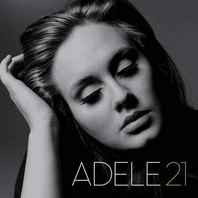
The portrait of Adele is incredibly emotive and captures a sense of passion and pain , it documents the beauty in emotion. This is enhanced by the use of a desiderated ( black ad white) image, this immediately gives an indication of nostalgia and therefore a theme of the past.
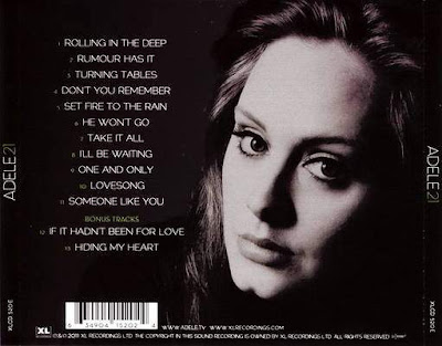
The back cover is also quite emotive, after having looked at the front portrait to then see the rear portrait with her eyes open creates a connection between the viewer and the artist, by looking into the centre of the lenses Adele has made eye contact with whoever looks at the picture making an gesture of almost compassion and appreciation for having picked the CD up to check the track listing.
Font
Potential fonts I may choose for the text on my digipak and advertisment. I want the font to be easy and clear for the viewer to be able to read, as well as bold amd eye attracting; making it easy to spot.i also want my font to be bold and in chapital letters. in addition to the colour of the font complimenting the background and the image of the artist. As my digipak is in black and white with a hint of grey, I think that the colur that best compliments this is a light grey. I also want the font to appeal to my target audience so i need to make sure it appeals to both sex.
Inspirational examples of a digipak that has inspired me
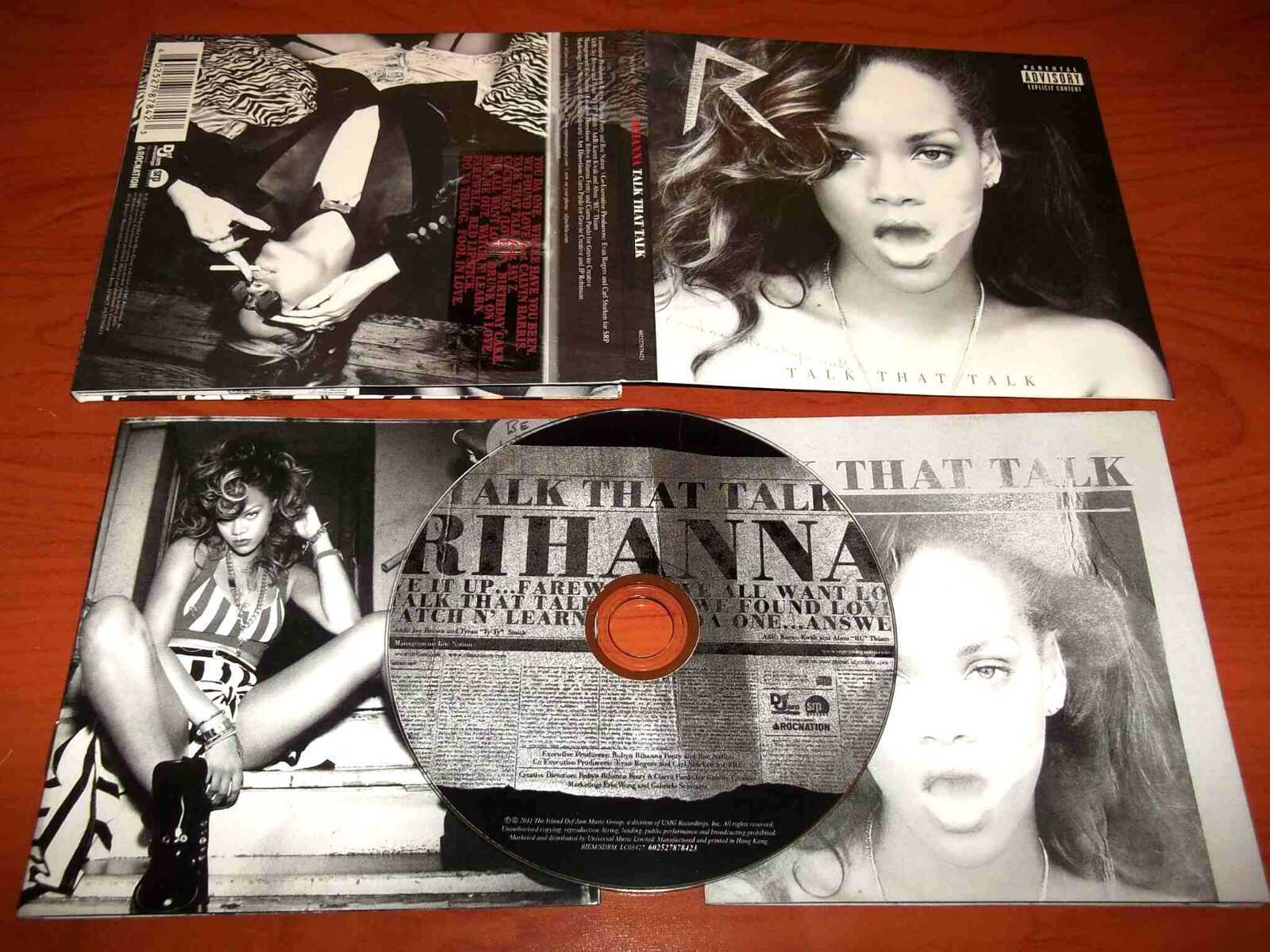
Some thing the digipak includes that I may incorporate:
- Record label information
- Name of the album
- Name of the artist
- Legal waring hinting some of the themes within
- Black and white theme connected to some of the song themes within the album
- The logo of the artist which was on a previous album
- The album track titles, including popular songs
- Font that links to the album
- A album thank you
- A advertisement including the artist name once again
- Post cards including images of the artist
Key elements
Key elements of a good music DVD digipak: Artwork/photography - images of band/artist - band/artists logo - record company logo - music industry logo (PRS) - DVD/CD logo - BBCF classification - barcode - explicit warning logo Text - Band/artist name - DVD title - Track listing on reverse - reviews - credits - band/artist web address Design - Genre related - record label needs - booklet - gatefold Bonus DVD – which may contain bonus features such as; behind the scene footage, tour diary, video interviews, documentaries, out-takes, music video, photos Bonus CD – which may contain exclusive content.
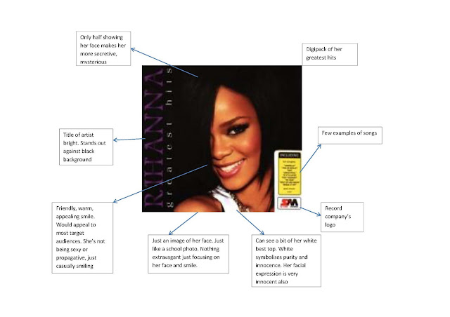
Features of a Digipak
A Digipak typically consists of a gatefold/ book style paperboard or card stock outer binding. It hasone or more plastic trays which can hold a CD or DVD attached to the inside. The Digipaks are analternative to jewel cases used by major record companies.Digipak-style packaging is often used for CD singles or CD albums. Such packaging is less resistantto abrasion than the jewel cases, so it shows sign of wear quickly.Plus there are less likely to crack than a jewel case, although the disc tray inside it is rather brittle isis likely break if the package is crushed.Manufacturers have sought to reduce environmental impact and improve functionality byintroducing recycled materials to the trays of the digipak. One has announced a 100% post-consumer PET tray made of recycled bottles. Another further step taken is by totally eliminating theplastic tray and replacing it with a paper tray made of sugarcane and an egg carton. Includingprinters they use recycled or sustainable material for the board stock. There are numerous variations of sizes and designs, the most popular design is the regular 140mm x 120mm, 4-page version ‘Digipak’ is the registered trademark for AGI media ‘ Digipack’ is the generic term and doesn’t have all the exact key elements of a ‘digital’
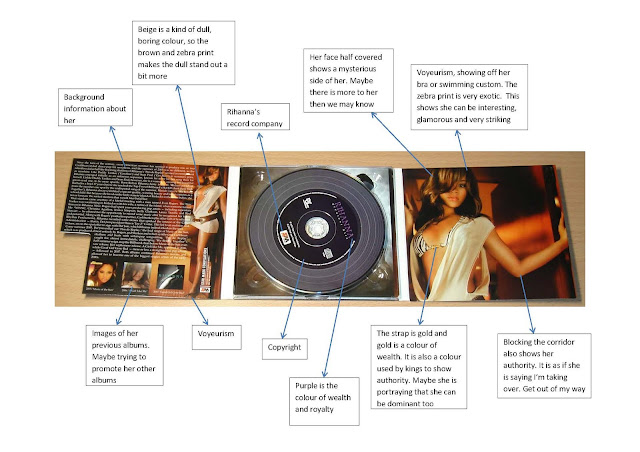
Saturday, 19 January 2013
Friday, 18 January 2013
Ancillary products: Possible sales idea?
A possible idea to promote the album whilst bring in some extra revenue for the artist would be to sell T-shirts with the advert printed on the front like this one:
Wednesday, 16 January 2013
Researching Ancillary products: Analysis of three magazine advertisements
Here we have 3 very different advertisements. I would say that the second one is the best one and it would be a good idea to incorporate some of its ideas into my own advertisement. I like the image of the artist, the pose reveals a bit about her personality; slightly mysterious. Also, I like the inclusion of the social networking sites which is important in promoting an artist in today's age. Interaction with fans is an important marketing/promotion tactic, as this could increase the fan base of the artist. The other advertisements are also very good to, reviews from well known newspapers, website and magazines add to the credibility of the actual songs on the album.
Planning Ancillary product: Choosing font Album/Artist name
This aspect of creating my ancillary products i found most difficult of all, which font do I use. The decided to deviate away from the original font I had planned to use because as I saw the product begin to take shape I just didn't think that this font ' Eras Bold ITC' would work. So for reference I took another look at other digipak's, especially 'On A Mission' - Katy B. I found that it made use of quite a slender font type rather than bold lettering. This is done to relate to the genre and sound of the music, every detail counts.
Scrolling through the fonts was a very time consuming process, which I can avoid in the future with slightly better planning.
Scrolling through the fonts was a very time consuming process, which I can avoid in the future with slightly better planning.
The first image below is my original font, the second image is my font as of now which I think is much more presentable, and relates to the genre of music more than the first one.
Photoshop: Removing the white background
A stumbling block which I ran into was how do I remove the white background from images and logos to use them on my digipak. After checking out a number of videos I stumbled across how to do it properly. It was difficult at first but I know have the hang of it.
Here is the Columbia Records logo, which unfortunately came with the white background surrounding it. Putting it on the album cover like this wouldn't be a big deal but its the small details which help sell albums. Central to this method is the 'magic wand' tool which looks like this.
It allows you to highlight the outer white background of the image to make it a transparent layer in a few simple steps.
- First you delayer the image from the background like so:
- You then open up a new layer and put the image right at the top of the layer list.
- From here you select your magic wand tool and click on the white background which will highlight every thing around the image like this:
- From here you press delete and the logo should be left on a transparent background waiting to be added to the digipak:
Without the white background it looks far more presentable.
Monday, 14 January 2013
Ideas for background of Advertisement
Possible idea for the background of my advertisement, this tutorial shows you how to create an abstract background quite simply, which I could somehow use to relate to the genre of the album.
Ancillary work: Software
To create my digipak and advertisement, I have decided to use 'Photoshop Elements 11'. Originally we were told to use 'Quark Express' on top of Photoshop to add text easier, but I have decided not to use it as I feel Photoshop allows me to selects which font an add any effects i like. 1 of the fonts I used was an extra and needed to be downloaded and installed though and works fine now. I think we were advised to use Qwark for fonts because of the need to create new layers each time we want to add any text but personally I find it rather stress free.
Above are all of the layers I used to add the track-listing to the back panel.
Above are all of the layers I used to add the track-listing to the back panel.
Product of Ancillary work: Inside panels so far
Inside panels I fell need to be more creative than the outer panels as its not simply about showcasing the artist to possible customers. It must process some sentimental value to the fans of the artist and look very presentable when the case is opened up. So for my inside panels I decided to go with and abstract view I took of city lights, I had many ideas which i created from simple things in the surroundings or around me and so went with the city lights idea. For the other panel I was influenced by this video tutorial
It uses the 'picture stack' effect to create a collage effect which I thought could give it an interesting look.
It uses the 'picture stack' effect to create a collage effect which I thought could give it an interesting look.
The process of digital downloads; what it means for digipaks
Illegal downloading is a an unfortunate problem which exists today. It has caused artists and record labels to lose millions of pounds. As a result of digital downloading in general, the importance of digipak's has slightly diminished, but is still important as even digital downloads still process album/single artwork.
Sites like 'dopehood.com' allow for people to download the album as a 'RAR' file, which looks like this:
Using a program called 'WinRAR' it is then possible to extract the file and produce a folder which contains the tracks, as well as the album artwork as a 'JPEG' file.
Sites like 'dopehood.com' allow for people to download the album as a 'RAR' file, which looks like this:
Using a program called 'WinRAR' it is then possible to extract the file and produce a folder which contains the tracks, as well as the album artwork as a 'JPEG' file.
From here the songs can be opened up on software such as iTunes ready to be played or synced to a device like an iPod or an iPhone
)Artwork on iPod)
Product of Ancillary work: Initial digipak idea
This was my first attempt at making my digipak. Upon feedback from teachers, I have decided to redo the front and back panels to coincide with the inside panels as they look like two completely separate products. In the initial front and back covers, I copied the color of the background and used it to almost erode away parts of the picture, to give off a fade effect.
To then get the blur effect, I used the blur tool.
The feedback I gained suggested that the artist looked like they were 'floating' and not fully showcasing the facial features of the artist which is the most important thing as the digipak should promote the artist in every aspect.
Also, the album title and artist name takes up too much of the front cover, the artist should be the main focus, not sharing that audience focus with the text.
Friday, 11 January 2013
Product of Ancillary work: Levels
Adjusting the levels of the image allows for a sort of 'tint' effect to occur. Sliding the input level and output levels create differing effects. This option can be found under the 'Touchups' section. The video tutorial below explains this in detail, which is where i learned the basics of this feature from.
Tuesday, 8 January 2013
Mock up of my CD advertisement
This is my mock up of my CD advertisement, I have decided that I would like to have the picture of the CD front cover on the left along side with various quotes from newspapers. On the right side of the advertisement will have tour dates of the artist touring in the Uk.
The colour scheme that I have decided to go for is for the background to be the colour green, a light shade of the colour and i would like the text to be a shade of purple of lilac. I would like these colours as they represent more of a cool and vibrant feel to the album itself. The name of the artist will be in a large font at the top of the advertisement which would stand out to the viewers. I would like a border to go around the advertisement as I feel it makes the 'look' more neat.
The colour scheme that I have decided to go for is for the background to be the colour green, a light shade of the colour and i would like the text to be a shade of purple of lilac. I would like these colours as they represent more of a cool and vibrant feel to the album itself. The name of the artist will be in a large font at the top of the advertisement which would stand out to the viewers. I would like a border to go around the advertisement as I feel it makes the 'look' more neat.
Subscribe to:
Comments (Atom)


