Friday, 1 February 2013
Signing off my blog
This is the end of my blogging process for A2. I have thoroughly enjoyed this blogging task at times and it has been a long term project which I have embraced, adding numerous blogs simply from inspiration and ideas, which I found quite fun. All in all it was very enjoyable.
Coursework signing off
I have found A2 media coursework more challenging than AS but hopefully I have done enough to gain a good grade overall!
Bye :)
Bye :)
Evaluation : Question 4
What have you learned from your audience feedback ?
Overall the feedback that I got from the audience were positive. When my music video was played in the cinema, the immediate reaction from the audience was positive. Throughout the editing process of the music video the continuous feedback that was given is that we needed to cut more whilst editing and have more varied shots, this is what noticed when I got feedback from any part of filming the video and also part of the editing too.
The screenshot above is feedback which was given from the teacher about our rough cut. The teacher said that she liked the 'realness' of the music video compared to the studio shorts but the music video needed to pick up the pace for it to be more faster. I agreed with this as I thought back at the rough cut stage the video did lack pace and was rather slow, I also did agree with the statement of the the outside shots were better than the studio shorts, I believed this was because of the lighting in the studio compared to the lighting whilst I filmed outside, the lighting in the studio made the video lack professionalism compared to the studio shots.
The scrren shot above feedback from a student. The student said that he liked the slow motion effect on the artists hands which were used and the location of where the music video was filmed. I agree that the slow motion effect on the artist hand in the beginning of the music video was effective, it made the video seem more effective and professional. I think as that effect was used it gave a strong opening to the music video and would attract the audience. I also think that where the filming took place was also very effective. I learnt from the feedback that more cuts were needed to make the video run more smoothly .
Close of my blog
I am glad that this cousework is finally over as I think it was stressful and tiresome, however I am glad of the final outcome and how far I have gone and what I have produced. I want to thank all the teachers and my group for all their help and commitment. Hopefully I get the grade that I think I deserve
Final Progress Review
Personally I think that my AS blog has more use of ICT than A2, however I feel that I have developed my skills and knowledge within the use of ICT in A2. I feel that my blog shows that I have deeply researched into my music video and ancillary work, however I must be honest and say that I could have been more dedicated and shown extra research and planning as there was a little bit of a gap in my blogging which was my vlogs showing my progression, as well as some blogs not being in order. I am not intientirely sure of the exact amount of blod i produce indiviually. If I could change something about my blogging it would be me being more dedicated to blogging by doing extra blogging and not leaving gaps within my bloggng.
Evaluation : Question 3
Question 4
Audience Feedback
From evaluating the audience fedback, I have come to the conclusion that our music video was very effectivie as it fit the genre that we wanted, dubstep. Also I have noticed that many people enjoyed the fast paced editing and the fast cuts as it has been cut to the beat of the song. Also, as the climax of the song increases and the start of each chorus. So does the editing and cuts. Different transitions where used such as flash and cross dissoves to make the video more dramtic. They were able to relate to this type of genre because it is the type of music that is currently up and coming with higher demands from young people to see it more on our tv and computer screens. One of the main criticism we reciveved was that our video needed to include more locations and that our artist should put more enthusiasm when performing and show more movement within the performance.
In my opinion I agree with what the audince had to say, We ony had two differnet locations, however more of the footage was filmed on a green screne. We should of maximised our location and filmed more basetracks so we could have more of a variety of footage to choose from, this made our editing process very limited. If I was to film our music video over again and make changes I would film in three more locations, Make the artist use and show more enthusiasm in her movement and her performance and definately film more base tracks so that we have a variety of footage to use and choose from when editing, in which woulkd make the editing process easier.
Question 2
I made the colour scheme of my digipak and it
the
advertisement match the colour scheme of my video, which was black and
white. I
also used images that I thought linked to my video as the artist looked
very
similar in the video as well as the pictures used in the digipak and the
advertisement. I also used one of the images from a shot from my music
video, which was the
forest that it was shot in, so the audiee can ink to to it. The audience
can
reconinise the link between both the video and the digipak as it is
clear who
the artist is in both as she dominates both the video and the digipak as
she is
looking at directly the camera through both. My ancillary product has a
clear
and simple text in order that the audience could read it. I also use
text that
I thought was able to relate to both males and females, as my core
target
audience applied to both sexs. I believe my target audience can relate
to bot
my video and ancillary work because it is modern and trendy, I aimed to
attract
teenagers so in both my music video and ancillary work I dressed the
artist in the
latest fashionable clothing.
Similar images from my music video and my ancilary work
 |
| Music Video |
They type of shots are both close ups and long shots of the artist.
Also there was the same type of filter used in both video anddigipak image. the artist is lookin directly at the caemra. She is also wearing black in both imagese as well as having the same hair stylle a make up.
 |
| Music Video |
I used the same background "location of where my music video was shot on my ancillarywork so that the audience can relate and regonise the digipak and link it to the video.
 |
| Ancillary Work |
 | |
|
Both images are similar as ther show the rtist looking away from the camera, looking ahead into the distance. The shot type is alsosimilar as it show the arist body.A similar filter is used her in which nakes the image black and white.
 |
| Music Video |
Evaluation : Question 2
How effective is the combination of your main product and ancillary texts ?
Firstly I think how effective the combination of both the music video and ancillary texts are really important to any artist, these are effective because they show an image to both the respected target audience and sometimes to the album.
An example that I will use to demonstrate this before talking about my own combination of both music video and ancillary texts is Adele. The colour scheme from one of her music video displayed the tone and mood of the song, the music video that i'm talking about will be shown below.
The music video above is 'Adele - Someone like you '. the colour scheme throughout the song is black and white, I think that colour of the video goes well with the song, the lyrics of the song have a more mellow tone which connotes the the black and white colour of the music video. This is effective because the audience will grasp an idea of what the song is about just through the colour of the music video. The colour black and white gives off a more serious impression of the song
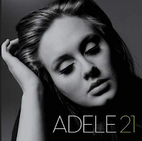 The colour scheme of the digipak which is shown to the left also was the same colour as one of the music video's which was in black and white. This also shows how effective the combination of the artist main product and ancillary texts was because both the colour scheme was black and white . The front cover of her album cover corresponds with the music video above.
The reason why I chose to analyse both Adele's digipak and music video was because the colour scheme was very similar to my own music video and album cover and inside panels, however my advertisement was different to both my music video and digipak. The images of my digipak will be shown below, as I can't embed my music video I will talk through my music video.
The images below show my ancillary work of my digipak.
My front and back cover of my ancillary work is very similar to my music video, through the colour scheme of my music video which was black and white, similar to my ancillary work which is also black and white. The close ups on both my digipak and my music video is also very similar which I find effective because it shows the artist face. I think my ancillary work is successful but the effects used on the images for my digipak could have been used. The yellow text that I used stands out really well on the black background which would attract customers eyes in music stores. What I could have improved on my digipak is the colour of text I chose the use on the CD, to improve this I could of put the text in bold which would make it stand out.
The image above is my advertisement, I chose to use a different colour for the background. I chose to do this because I feel that the colour black and white to be used as an advertisement would connote a more mellow feel to the album, however using the colour white would have a more positive feel and would appeal to the audience more. The image of the artist would stand out more on a white background rather than on a black and white background which I believe that it would be more effective.
Firstly I think how effective the combination of both the music video and ancillary texts are really important to any artist, these are effective because they show an image to both the respected target audience and sometimes to the album.
An example that I will use to demonstrate this before talking about my own combination of both music video and ancillary texts is Adele. The colour scheme from one of her music video displayed the tone and mood of the song, the music video that i'm talking about will be shown below.
 The colour scheme of the digipak which is shown to the left also was the same colour as one of the music video's which was in black and white. This also shows how effective the combination of the artist main product and ancillary texts was because both the colour scheme was black and white . The front cover of her album cover corresponds with the music video above.
The reason why I chose to analyse both Adele's digipak and music video was because the colour scheme was very similar to my own music video and album cover and inside panels, however my advertisement was different to both my music video and digipak. The images of my digipak will be shown below, as I can't embed my music video I will talk through my music video.
The images below show my ancillary work of my digipak.
My front and back cover of my ancillary work is very similar to my music video, through the colour scheme of my music video which was black and white, similar to my ancillary work which is also black and white. The close ups on both my digipak and my music video is also very similar which I find effective because it shows the artist face. I think my ancillary work is successful but the effects used on the images for my digipak could have been used. The yellow text that I used stands out really well on the black background which would attract customers eyes in music stores. What I could have improved on my digipak is the colour of text I chose the use on the CD, to improve this I could of put the text in bold which would make it stand out.
The image above is my advertisement, I chose to use a different colour for the background. I chose to do this because I feel that the colour black and white to be used as an advertisement would connote a more mellow feel to the album, however using the colour white would have a more positive feel and would appeal to the audience more. The image of the artist would stand out more on a white background rather than on a black and white background which I believe that it would be more effective.
Thursday, 31 January 2013
Tuesday, 29 January 2013
Evaluation: Question 4
Audience Feedback
I interviewed around 5-6 people and asked them about their initial thoughts on the video, what they liked about the video and what they thought could have been changed or improved. The response I recieved from the audience were more or less all the same.
Each interviewee stated that they really enjoyed the editing of the video specifically the strobe lighting effect. They thought it flowed well, was edited well to the beat and really had the audience engaged as it built up to it's climax before each chorus. A very positive response, the audience understood what genre of music it was and who it was targeted at. They were able to relate to this type of genre because it is the type of music that is currently up and coming with higher demands from young people to see it more on our tv and computer screens. We recieved the same two criticisms of the video which was that our video needed to include more locations and that our artist should put more enthusiasm when performing. Over all the audience thought it was a very good video.
Taking on board with what the viewers thought, I couldn't agree more. Our video did lack in base tracks and we may have used about 3 or 4 but there wasn't a significant amount of difference. You couldn't tell them apart and majority of our video was filmed in the green screen. If I could change that I would definiately add 2 or 3 more locations, ones that were very significant, that stood out and that you could tell it was somewhere else. In terms of performance I personally thought I performed well taking into account that I don't really like being infront of the camera but rather behind it. However, my group couldn't make the risk of trying to find an artist within college or outside of college becuase they probably wouldn't be as comitted as us as it isn't their work. Over all I'm very happy with the response and video.
Monday, 28 January 2013
Saturday, 26 January 2013
Evaluation: Question 1
In what ways does your media product use, develop or challenge forms and conventions of real media products?
In many ways my media products follow the conventions of real media products but also challenge and evolve them to fit into today's perception of the ultimate media products. Products which look attractive and pull in possible customers, relate to the genre of the music and artist image and allow for fans to interact with the artist.
According to Andrew Goodwin, music videos don't follow the traditional narrative styles of novels and films for example. This is because pop videos are built around songs and often songs do not pose traditional narrative structures. So in place, there are 3 different types of relation between songs and their videos. The first is called illustration, this is when the video tells the story of the lyrics. An example of this style is Fireflies- 'by Owl City'.
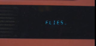
You'll notice that every time the artist says the word Fireflies, it actually appears in the video on a prop in the video. So in essence the video is part of the meaning of the lyrics. The word fireflies is written on children's toys which coincides with the meaning of the video, which is supposed to be of a grown man with a free child-like spirit.
Carol's observation lead her to the conclusion that edits in music videos come much more frequently than in films.
- The usual rules of 'continuity' editing are broken in order to draw attention to what is on screen.
- Edits may be really obvious to draw attention to themselves, such as wipes and special effects added.
- Jump cuts are often used.
- A master shot (base track) is frequently used to give the video a structure. Also, the base track often reflects part of the artist, song nature or actual lyrics. For example, this base track from MGK ft. Waka Flocka- 'Wild Boy' contains walls with graffiti, and also stick set with fire, reflecting the chaotic nature of the song.
In many ways my media products follow the conventions of real media products but also challenge and evolve them to fit into today's perception of the ultimate media products. Products which look attractive and pull in possible customers, relate to the genre of the music and artist image and allow for fans to interact with the artist.
According to Andrew Goodwin, music videos don't follow the traditional narrative styles of novels and films for example. This is because pop videos are built around songs and often songs do not pose traditional narrative structures. So in place, there are 3 different types of relation between songs and their videos. The first is called illustration, this is when the video tells the story of the lyrics. An example of this style is Fireflies- 'by Owl City'.
You'll notice that every time the artist says the word Fireflies, it actually appears in the video on a prop in the video. So in essence the video is part of the meaning of the lyrics. The word fireflies is written on children's toys which coincides with the meaning of the video, which is supposed to be of a grown man with a free child-like spirit.

The next structure is called amplification and this is where the video adds layers of meaning to the lyrics to enhance it in a number of ways. A video I think does this well is Saigon ft. Just Blaze- 'Gotta Believe it'.
The video is based upon the hardships that the artist has been through in his life. Claiming people are desperately trying to keep their kids off the streets, the video has scenes of a young boy locked in a jail cell, telling the audience that is is much easier said than done, due to the difficult living conditions in which the government has done nothing to help. - ' They '(the government)' got you working two jobs, tryna make ends meet, you just tryna keep your kids off the street.'
The last structure is called disjuncture and this is when their is very little connection between the video and the lyrics or the video actually contradicts the lyrics. An example of this style is Michael Jackson- 'Man In The Mirror.'
The scenes in the music video have absolutely nothing to do with the video and are there for other dramatic purposes. For example this particular scene of government officials shacking hands doesn't apply at all to the lyrics of the song, though it in not just randomly put in. It is used to represent peace, a theme the artist would like to promote in the grand scheme of things.
Music videos are used to promote the artist which is the most important thing. Andrew Goodwin points out that artists will use direct address (look directly at the camera) to almost communicate directly with the audience. This technique was used in my video.
Carol's observation lead her to the conclusion that edits in music videos come much more frequently than in films.
- The usual rules of 'continuity' editing are broken in order to draw attention to what is on screen.
- Edits may be really obvious to draw attention to themselves, such as wipes and special effects added.
- Jump cuts are often used.
- A master shot (base track) is frequently used to give the video a structure. Also, the base track often reflects part of the artist, song nature or actual lyrics. For example, this base track from MGK ft. Waka Flocka- 'Wild Boy' contains walls with graffiti, and also stick set with fire, reflecting the chaotic nature of the song.
- The camera may move in time with the music.
For my video i used many of these ideas. Like I mentioned above i used the direct address technique in my video, to communicate with the audience. I think my music video follows the amplification structure from Goodwin's theory. This is because the video does not attempt to tell the story of the lyrics but add layers of meaning to it. The song itself Katy B- 'Broken Record' has a slightly moody, confused feel to it so to further illustrate that I added scenes like this one below, which shows the artist walking up and down, not quite shore on a choice of action, which adds to the confusion of the lyrics. Also, there are lots of examples of jump cuts and the number of small quick edits draws attention to what is on screen.
The main influence of my video was actually the video to the original song Katy B- 'Broken Record'. The effect at 00:48 to 00:52 was created by increasing the speed of the song and then filming the scenes with regular body movements. I quite liked this idea as when it was then put over the original speed track, the artist had a sort of 'gliding' effect, that we did not replicate perfectly but tried too. Also, the original video has the artist lying down in a number of shots which I also implemented. The main reason for that was to try and follow some conventions of the genre and not challenge them too much as fans of this form of UK garage/R&B/2 step don't want something that doesn't apply to the music or them. Looking at other videos from this genre the music video doesn't follow the regular conventions when it comes to location, which are usually in clubs or urban street locations, as seen in Craig David- 'Rewind' for example. The reason for this opposition in conventions in regards to location is because I wanted the artist to be the single most important thing in the video, whereas I feel a club scene for example provides many distractions for the audience.
I would say that my Ancillary products follow some very important conventions of the genre. I've seen many advertisements of this genre try to pick a color which refers to the music on the album which is what I did with this blue color, it adds a moody feel. Also, I noticed that other adverts of this genre had the reviews from different newspapers/magazines/websites whereas other adverts from different genres didn't, so i made sure to include that.
As far is my digipak is concerned, I wanted to have a color that not only fit the music f the album but had some sort of effect to almost enhance the features of the artist. So I decided to use the 'diamond style gradient tool' (Photoshop) to fill the areas around the artist. I feel the genre doesn't have the most obvious conventions to follow besides from showcasing the artists features which I did with good picture selection, so it was important to be creative with the rest and create the rest of the digipak which specifically related to the actual music of the album. So I used the 'picture stack' effect to go hand in hand with the album title 'Broken Record' as it represents a broken element in the artists life.
Friday, 25 January 2013
Sunday, 20 January 2013
Adele Digipak Inspiration
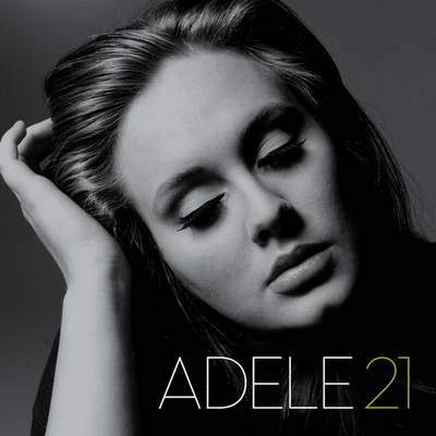
The portrait of Adele is incredibly emotive and captures a sense of passion and pain , it documents the beauty in emotion. This is enhanced by the use of a desiderated ( black ad white) image, this immediately gives an indication of nostalgia and therefore a theme of the past.
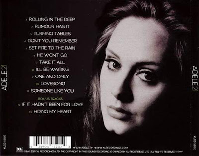
The back cover is also quite emotive, after having looked at the front portrait to then see the rear portrait with her eyes open creates a connection between the viewer and the artist, by looking into the centre of the lenses Adele has made eye contact with whoever looks at the picture making an gesture of almost compassion and appreciation for having picked the CD up to check the track listing.
Font
Potential fonts I may choose for the text on my digipak and advertisment. I want the font to be easy and clear for the viewer to be able to read, as well as bold amd eye attracting; making it easy to spot.i also want my font to be bold and in chapital letters. in addition to the colour of the font complimenting the background and the image of the artist. As my digipak is in black and white with a hint of grey, I think that the colur that best compliments this is a light grey. I also want the font to appeal to my target audience so i need to make sure it appeals to both sex.
Inspirational examples of a digipak that has inspired me
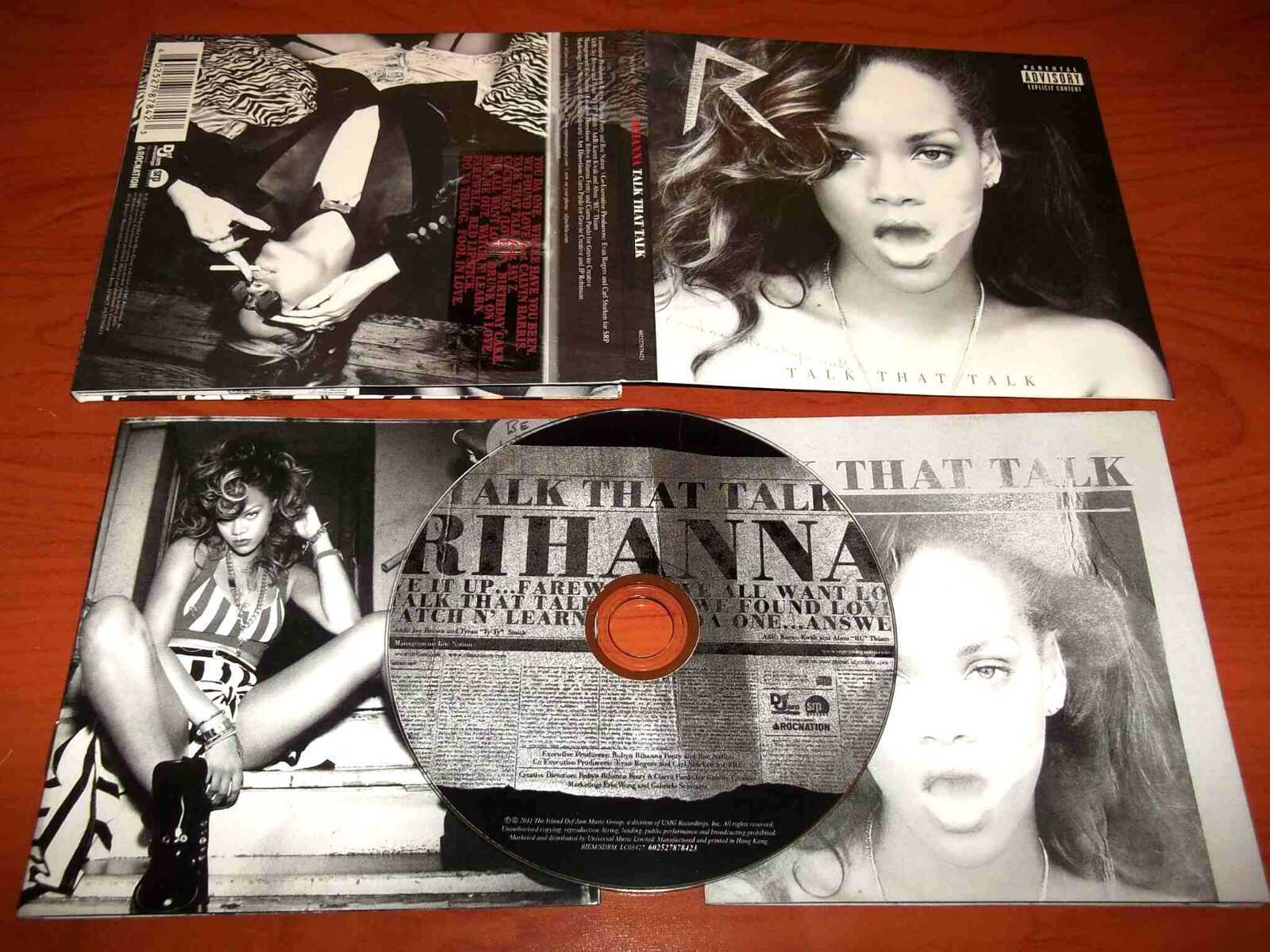
Some thing the digipak includes that I may incorporate:
- Record label information
- Name of the album
- Name of the artist
- Legal waring hinting some of the themes within
- Black and white theme connected to some of the song themes within the album
- The logo of the artist which was on a previous album
- The album track titles, including popular songs
- Font that links to the album
- A album thank you
- A advertisement including the artist name once again
- Post cards including images of the artist
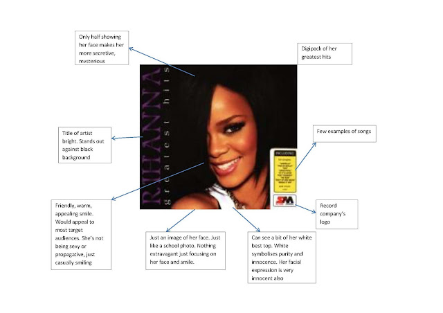
Key elements
Key elements of a good music DVD digipak: Artwork/photography - images of band/artist - band/artists logo - record company logo - music industry logo (PRS) - DVD/CD logo - BBCF classification - barcode - explicit warning logo Text - Band/artist name - DVD title - Track listing on reverse - reviews - credits - band/artist web address Design - Genre related - record label needs - booklet - gatefold Bonus DVD – which may contain bonus features such as; behind the scene footage, tour diary, video interviews, documentaries, out-takes, music video, photos Bonus CD – which may contain exclusive content.
Subscribe to:
Comments (Atom)


